I’ve spent countless hours looking over design magazines, color swatches, and client projects, and I’ve learned one universal truth: the right paint color can completely transform your living room. It’s not just about trends or what’s “in” this year. It’s about finding shades that bring harmony, personality, and a sense of welcome to the most social space in your home.
Whether you’re drawn to bold statements or timeless neutrals, the perfect color can elevate your living room from ordinary to extraordinary. Here are 12 designer-approved colors I’ve seen work wonders time and time again.
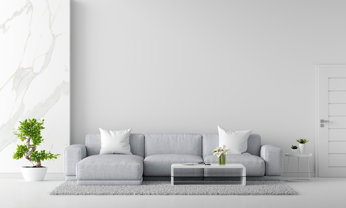
Classic White: Timeless Simplicity
I always recommend starting with classic white if you want your living room to feel bright, open, and timeless. White reflects natural light beautifully and creates an airy backdrop that can make even the smallest spaces feel expansive. A crisp, clean white acts like a blank canvas for furniture, artwork, and textures.
It’s perfect for those who like to change up decor seasonally or prefer minimalistic interiors. But don’t mistake white for boring: the subtle differences in undertones, from cool blue hints to warm creams, can dramatically affect the room’s mood.
Greige: The Perfect Balance
There’s something undeniably sophisticated about greige, a chic fusion of gray and beige. It’s a color I recommend to clients who want a modern, adaptable palette without sacrificing warmth. Greige works well with wood accents, leather furniture, and both contemporary and traditional decor.
It’s especially forgiving in living rooms with varying light throughout the day. The softness of greige doesn’t compete with bolder pops of color you might add through rugs or pillows, and it effortlessly ties together different elements in an eclectic space.
Deep Navy: Bold Yet Classic
For those ready to take a confident step away from neutrals, deep navy is a favorite of mine. Navy walls lend a living room an intimate, cocoon-like atmosphere while still feeling elegant and grounded. I love pairing navy with brass fixtures, crisp white trim, or natural wood to avoid the space feeling too dark.
Navy is surprisingly versatile: it reads as a neutral but brings a strong sense of character. If you have high ceilings or a lot of natural light, navy can anchor the room beautifully without overwhelming it.
Warm Taupe: Cozy Elegance
Taupe might not sound exciting, but in practice, it creates one of the coziest, most inviting living rooms I’ve seen. There’s a reason designers keep returning to warm taupe. It straddles the line between gray and brown in a way that flatters virtually any decor style.
Taupe’s warmth helps larger spaces feel more intimate, and its understated nature means you won’t tire of it after a season. It works wonderfully with muted greens, dusty blues, or soft blush accents for a calming effect.
Soft Sage: Bringing Nature Indoors
I find soft sage green irresistible in living rooms because it instantly brings the serenity of nature indoors. It’s a subtle, earthy hue that makes a space feel fresh and peaceful. Sage pairs particularly well with natural materials like rattan, jute, linen, and warm woods.
It’s ideal if you’re leaning into nature-inspired design or simply want to create a soothing sanctuary. Even in urban apartments, sage can give you the tranquility of a countryside retreat.
Blush Pink: Understated Romance
Blush pink has matured from a trendy accent to a design staple in recent years. I’ve used it in several projects to create living rooms that feel light, romantic, and modern without being overly sweet.
The key is choosing a blush with a muted or dusty undertone because it reads more sophisticated and less like a child’s room. Blush walls beautifully complement grays, whites, and darker accents like charcoal or navy. It’s a great way to soften the edges of contemporary spaces or add warmth to minimalist interiors.
Charcoal Gray: Modern Drama
When clients crave a dramatic yet refined look, I almost always suggest charcoal gray. It has a moody, luxurious vibe that can turn a bland living room into a striking statement space. Charcoal works best in rooms with a lot of lighting or where you can add layered lighting with lamps and sconces.
I’ve found that softening charcoal with plush textiles prevents it from feeling too cold. Metallic accents like brass or gold stand out beautifully against charcoal, giving the room a sophisticated edge.
Creamy Beige: Inviting Versatility
Creamy beige is another classic that never fails to impress. Compared to stark white, creamy beige adds warmth and comfort while retaining the same sense of openness. I recommend it for traditional, transitional, or coastal-inspired living rooms.
It creates a welcoming base that allows colorful or patterned furniture and accessories to shine. In spaces with lower natural light, creamy beige prevents the room from feeling gloomy by adding a soft glow.
Muted Terracotta: Earthy Sophistication
Terracotta shades are trending, but I’ve long loved muted terracotta for the unique warmth it brings to living rooms. This earthy hue reminds me of desert landscapes and Mediterranean villas, adding an effortless sense of sophistication. It works well with rich leathers, rustic woods, and woven textures.
Muted terracotta is less intense than traditional burnt orange, which makes it easier to live with long term. It creates a grounded, cozy atmosphere perfect for gathering with friends and family.
Dusty Blue: Calm and Collected
Dusty blue is one of my personal go-to colors for living rooms where the goal is relaxation. This muted blue is soft enough to act as a neutral while still offering more personality than beige or gray. Dusty blue walls evoke a coastal breeze or a clear spring sky, making them ideal for spaces where you want to unwind.
They look stunning with natural fiber rugs, slipcovered sofas, and touches of warm wood or brass. I often use dusty blue in open-concept homes to create a cohesive flow between adjoining rooms.
Olive Green: Sophisticated Depth
When I think of a living room with sophisticated depth and timeless style, olive green immediately comes to mind. This rich, muted green feels both classic and fresh. It works particularly well with mid-century modern furniture, black accents, and antique brass hardware.
Olive green walls create a cozy yet refined ambiance, especially in spaces with tall ceilings or large windows that let the color’s complexity shine. I also love using olive as a backdrop for art and plants, amplifying the connection to nature.
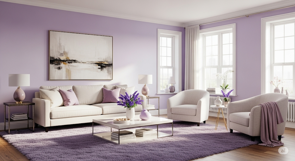
Soft Lavender: Unexpected Serenity
Lavender may sound like an unconventional choice for a living room, but soft, dusty lavenders can be absolutely stunning. I’ve seen them create serene, ethereal spaces that feel light and welcoming. Lavender pairs surprisingly well with neutral grays, warm creams, or even deep charcoals for contrast.
When used with elegant textiles like linen drapes or velvet throw pillows, it can elevate a living room into a truly unique retreat. It’s perfect for homeowners who want a touch of whimsy without creating an overly bright or juvenile territory.
How to Choose the Right Color for Your Living Room
Choosing your perfect living room color is as much about the space’s architecture and lighting as it is about your personal style. I always recommend testing large swatches on different walls to see how colors shift throughout the day.
Northern light can cool down colors, making warm tones essential to prevent a sterile look. On the other hand, southern light brings out the warmth in most shades, which can sometimes make colors look yellower than they appear on a swatch.
Another key consideration is the mood you want your living room to have. Do you want your living room to feel cozy and intimate? Lean toward warmer shades like taupe, terracotta, or olive green. Prefer an airy, open vibe? Light neutrals like creamy beige, soft sage, or classic white might be your best bet.
If you want a dramatic or sophisticated space, don’t shy away from deeper tones like charcoal or navy.
If you liked this article, here’s what you can read next: Transform Your Small Space with These 10 Storage Tips